Public reports › Special districts · Texas

Special district · Texas · population 20,000

Brushy Creek Municipal Utility District

bcmud.org · homepage scanned Oct 15, 2026 · WCAG 2.2 A/AA automated check

F

Accessibility score

56/100 · Failing

The homepage has critical barriers: content screen readers cannot describe, controls keyboards cannot reach, or text that cannot be read at normal contrast. This is the profile that draws complaints.

1

Critical

2

Major

0

Minor

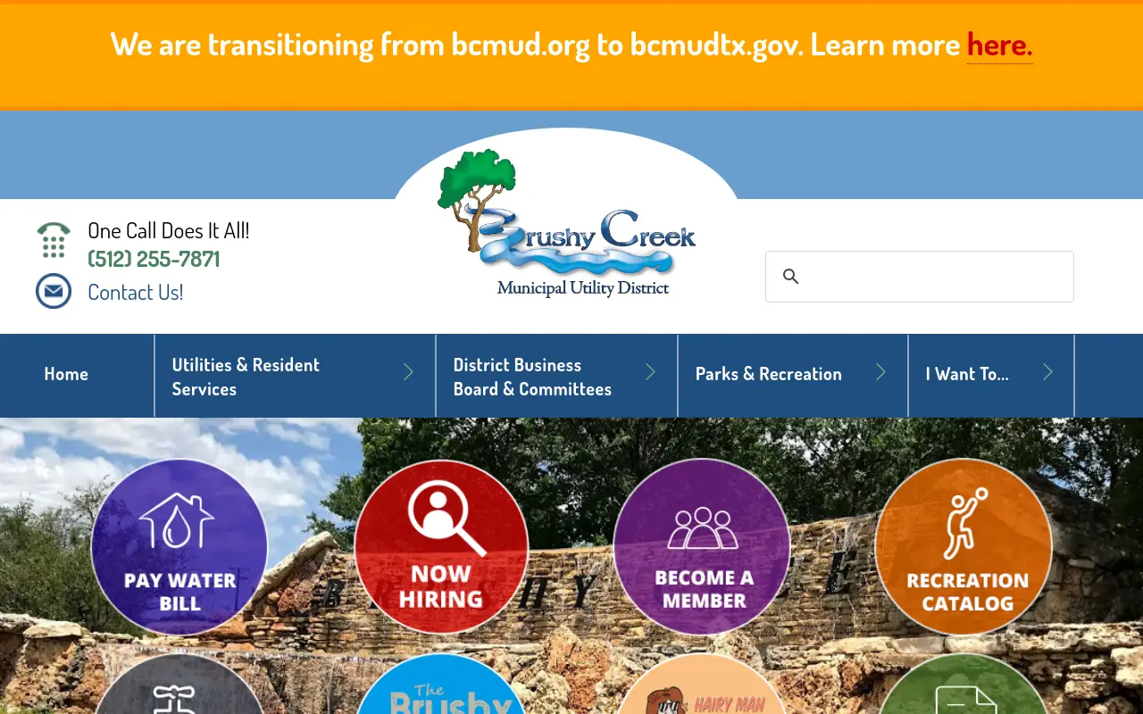
Screenshot of the Brushy Creek Municipal Utility District homepage at scan time

Homepage as loaded by our crawler on Oct 15, 2026.

In plain English

What this means for visitors

The scan found issues on the website that may cause problems for visitors with disabilities. For example, missing alternative text for images can make it hard for screen reader users to understand the content. To improve accessibility, start by adding alternative text to images and making sure links have readable text. This will help visitors who use screen readers or keyboard only navigation.

Findings

3 issue types found on the homepage

Each item is one failing rule; the count shows how many elements on the page trigger it. Severity follows axe-core impact levels.

#1CriticalWCAG 1.1.14 elementsRule details ↗

Images are missing alternative text

Screen readers can't describe these images, so blind and low-vision visitors miss the information they contain (flyers, event posters, charts).

Who it affects

Blocks a task outright for some visitors (for example an image-only flyer with no text, or a form field with no label).

First fix

Open the image in your CMS editor and fill in the 'Alt text' / 'Alternative text' field.

#2MajorWCAG 2.4.45 elementsRule details ↗

Links have no readable text

Screen readers announce these links as just 'link', so people can't tell where they go. Common with icon-only links and 'read more' buttons.

Who it affects

Makes a task significantly harder (low contrast, links with no name, missing frame titles).

First fix

Give every link visible text, or add an aria-label describing the destination.

#3MajorWCAG 1.4.32 elementsRule details ↗

Text doesn't have enough contrast against its background

Light grey text on white, or text over photos, is hard or impossible to read for people with low vision or color blindness, and for anyone outdoors on a phone.

Who it affects

Makes a task significantly harder (low contrast, links with no name, missing frame titles).

First fix

Use a darker text color or lighter background so the contrast ratio is at least 4.5:1 (3:1 for large text).

Severity guide

How to read the counts

Critical

Blocks a task outright for some visitors (for example an image-only flyer with no text, or a form field with no label).

Major

Makes a task significantly harder (low contrast, links with no name, missing frame titles).

Minor

Reduces clarity or consistency (heading order, landmarks, touch-target size).

What this grade does and does not cover

  • Covers: the public homepage only, loaded once in a desktop browser, tested with axe-core against WCAG 2.2 Level A and AA rules (a superset of the WCAG 2.1 AA standard in the DOJ rule).
  • Does not cover: inner pages, PDFs and documents, logged-in portals, video captions, alt-text quality, keyboard usability of custom widgets, or anything that needs a human judgment.
  • A grade is a monitoring signal, not a legal assessment or certification. How we score.